Tuesday, June 5, 2012

Blur Pictures!!

For this project, we were to intentionally blur our pictures.
We were to either use the panning technique, to follow the subject, leaving the background blurred, or have a moving subject, with the background remaining the same.
For a lot of my pictures, I used the second technique, because I thought it looked better, in my opinion, than panning. (Not to mention the only thing I could find to pan were cars and people, neither of which are very interesting).

For the blurring pictures, I had my mom stand and light a sparkler, then wave it around however she wanted.

A lot of these pictures turned out really cool, especially the M.


This was the first picture I took, and it turned out really cool.
I really like how the little sparks that fell off the sparkler blurred together to make the streams of light.


For this one, I just told my mom to either make zig zag lines up and down, or left to right. She chose the first one.
I think this is really cool, because it turned out to look like an 'M'.
This was my favorite blur picture because it was pretty unexpected, and it looks a lot cooler than some of the other ones.

I really like this one.
I told my mom to make figure eights over and over again, because I wanted to see what would happen. 
I love this picture as well because I set the shutter speed for a couple seconds longer, and by doing so, I allowed more of the sparks to fall and be recorded onto my film.


This is the same picture as above, but I printed it again, using a little bit longer printing time.
I like this one a bit more (but in a different way) than the one above. It's a lot darker, and it helps the sparkler's light stand out a lot more than the first one. But the first one is brighter and some of the sparks stand out a bit more than this one.

Wednesday, May 30, 2012

Multiple Exposure Pictures!


For this project, we were supposed to take a roll of film and run it through our camera twice, at an ISO of 800.


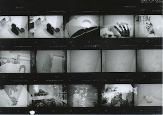
This is my contact sheet for this project.


This picture is one of my favorites.
It's a picture of my little sister (Which turned out like a silhouette) and a picture of our backyard.
I really like this, because the silhouette looks really cool, contrasting with the sky and the plants behind her.
In the negative, you can actually see her face a bit, but I like how, in the print, it turned out darker and most of the details are missing.


This picture is of the side of my neighbor's house, and a golden-colored sailboat we have hanging on our wall.
I think this picture turned out really cool, with the house really faded, making the boat stand out a bit more. 
You can see a tree in the corner (left) which adds to the picture.
I like how little sky there is, allowing you to focus on the boat and the house.


This is my absolute favorite picture.
I love my cat, and took several pictures of her with this roll. 
But this one is by far the coolest.
I somehow managed to take the pictures so she was facing two opposite directions. The over-lapping area looks really cool because her eyes really stand out.
My cat is pure black, so that makes this picture slightly scary, as she looks like she's glaring at the camera.
On the right, you can see the slight outline of her tail.
There's a tiny bit of shadow, which looks kind of cool on the left side of her.


For this multiple exposure, I took a silhouette of my hand, and then took another picture of a flower.
I really like this picture, because of how well the hand silhouette stands out against the brightness of the background.
I also like how part of the background is blurred, so it makes the flowers stand out a little bit more.


This picture is of my back deck (hence the potted plants) and then a shelf over my stairway in my house. (As you can see by the chandelier in the left corner.)
I think this one is really cool, because of how sharp all of the different elements of the picture look.
I like how each object is crisp and in focus, so you can tell what they are.


This is the last two multiple exposures stacked on each other.

I like it because it's very light in the background and dark in the foreground.

I thought this project was a lot of fun, since you never knew what you would end up with, and several of my pictures turned out really cool!

Tuesday, May 15, 2012

Scanned Face!!!


For this project, we were to scan our face using an Epson scanner, and then take it into photoshop. 
This was really entertaining, because the end product wasn't at all as you would expect.
This one was kind of funny to me, since one eye is looking to the side, while the other is looking straight ahead.


After I scanned my face, I decided to scan my hands. 
I think this turned out really cool, and I didn't rotate it horizontally, because I think the way it looks vertically is much more appealing and interesting.


For this scanned picture, I didn't rotate my head as much and I think this picture turned out pretty cool. 
I like how my ear is at the top, instead of attached to my head at the bottom.
I didn't rotate this one either because I think it looks a lot cooler when it's kept vertically.
What really grabbed my attention about this picture, was that my eye got all wavy, and I think it looks pretty darn awesome!

Friday, May 11, 2012

Infrared Pictures


For this project, we were to take digital landscape pictures, and then open them in photoshop to create infrared pictures. I really liked this project, because I was able to manipulate the different filters and adjustment layers in order to get the effects I wanted.


This is one of my favorites, since I think the buffalo look really cool in it.
I was thinking of making it look like a wasteland of sorts, with the buffalo being the only living animal.
I think it's really cool how cloudy the sky looks, and how it adds to that effect. 
I wanted to make the ground a yellow, but when I tried that, it changed the sky's color too much to make it seem more realistic, which was what I was going for.


This is another of my favorites. I love how the tree, having been mostly brown/black, wasn't effected by the infrared effect, while the background bushes and trees were.
I was going for again, a more realistic look, since that's what I find most appealing to me.
I love the clouds in this picture, since it's so dark and gloomy looking (OREGON!)
I simply love the tree as well, and am really glad the infrared effect didn't change it.


This picture is really cool, because of how many photo filters I added, to make the sky more blue.
I also like the two lone trees on the right, and the little flowering tree in the left corner, because those just add to the serenity feel of the picture.


I had a lot of fun with this picture. I wanted to make one like some of the examples, and make it look 'snowy'. So I added a lot of filters to keep the sky from turning any odd color, and changed the saturation/hue on the trees to get the look I want.
I'm really happy with this picture because I think it's probably one of the more realistic pictures (WHICH I LOVE!)


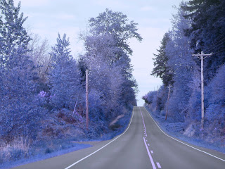
This was the same picture above (as you can see). except I changed the color a bit. I wanted to try a bluish look, because I thought it would look cool. And it did! I think by adding a lot of filters, I was able to manipulate the colors more, to get them to look the way I wanted.


This one turned out really cool. I like the sky, and how it was really bright, so it added more to the 'feel' of the picture. I wanted to go for a softer pink, and am really happy with it. The tall trees in the background, I think, look mysterious due to the brightness of the sky. It blots them out somewhat, but still allows you to know they are still trees.


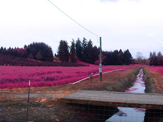
I like this one, because of how many different shades of magenta there are. In the front, you have the brighter ones, while in the back you have the darker and more subtle magentas. I especially like how the water has hints of pink, without making it seem way overdone.
I like how much depth there is to the picture, which looks really cool in my opinion.


This was a picture of a vineyard that I took. I really like how soft the pinks look on the trees, making it look almost orange.
I think the angle of this picture (with more sky on the right than the left) really looks cool, while the straightness/uniformity of the rows of vines, makes it really contrasting, yet cool.


Tuesday, May 8, 2012

Landscape pictures!


These are my contact sheets for the landscape project.


This is a landscape of a really old oak tree. 
I really like this picture, because it's really clear, and the leaves and branches on the tree turned out really beautifully. I adjusted the contrast so that the clouds would stand out more, and the tree would be darker.
I love the contrasts of this picture, and am really glad at how sharp it looks.
I think the clouds in the back are really nice, and they add to the awesomeness of the picture.

This is a picture of a small irrigation trench. I like this picture because of he depth involved in it.
In the back, there are a lot of beautiful trees, and in the front (which you can barely see) is a thin wire fence.
This picture is also in the infrared section because the colored version looked really cool as well.


This is the same tree as above, but taken at a further distance away.
I really liked this tree and took a lot of pictures, trying to see what shutter speed and aperture would make the clearest and most interesting picture.
My favorite part of this picture are the clouds in the background. While they are essentially the same as the picture above, these ones are lighter and less of them are in the picture.
I really like how the closer clouds are bright, while the ones in the back are darker.


This is another irrigation trench, taken from across a road. 
I really like this picture because of how much depth there is.
However, I wish there had been more clouds, which would have added to the picture in my opinion.
I also really like the grasses in the front, because they're really sharp and in focus.

Stacked negative Multiple Exposure pictures


For this project, we were to take two negative strips and stack them on top of each other to make a multiple exposure picture.
On the left is one of my self-portraits, with me holding my digital camera in front of my face, with sticking my tongue out.
On the left, which I think is really cool, is an upside down tree.
I didn't intend for the tree to be upside down when I stacked the negatives, but when I saw how cool it looked, I went ahead and printed the picture.
I think the tree is nice and clear, and the way it looks, it almost looks like something other worldly.
For some reason, there's a lot of smears, or something in the lower half of the picture, but again, I left that alone because it also looks otherworldly.
This is one of my favorite pictures I printed, and am really glad at how it turned out.


For this one. I used my sister's head instead of myself to stack with a tree.
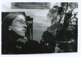
I think it looks kind of cool, the way her expression is one of either a 'oh really now?' sarcastic sort of, or a 'I hate this tree.' expression.
I think this looks a little more crisp than the one above, but the tone is completely different, just based off the fact that in the first one, I'm lighter and more whisp-y (due to the clouds) than my sister is.

Tuesday, May 1, 2012

Self-Portraits


These are my contact sheets for my self-portrait project.

For this self-portrait project, we were to take a roll of film and take pictures of ourselves. 
I thought this project was pretty fun, because I had a bunch of cool ideas.

For this picture, I thought it was kind of funny.
I took a picture of myself with my digital camera and set it on preview, then put it on the counter.
Then I stood in front of it with a sign that reads 'Confused? Me too.'
This picture didn't have the desired effect, because the picture on the digital camera didn't quite turn out.
But I think it's kind of a cool picture regardless.


This self-portrait is me laying on the ground surrounded by snowflakes.
I think this was one of the harder self-portraits I did, just because it was really difficult to lay on the ground where I knew I'd be in the picture, and then surround myself in snowflakes.
I like this picture because of how sharp the snowflakes are, and how you can clearly see that each one is different.
The only things I don't like about this picture is that there is this weird line cutting across the top part of the picture, where it turns darker than below it. I tried to make it a little less noticeable in photoshop, but nothing I tried made any difference, so I just made it blurred a bit.
The second thing I don't like about this picture is how out of focus I am. I think it would have looked better if both me, and the snowflakes had been in focus.


This was the third portrait I developed. I really liked this picture, but when it printed, it was really grainy and there was a lot of dust on the picture.


But when I was done fixing it up in photoshop, I ended up being really pleased with the picture. It took probably about 40 minutes to clean up the dust and figure out how to get rid of the water marks on the left side. But despite all this work, I really like this picture, and I think it's the best of my self-portraits. 
In my hand, I'm clutching a little gold bow and I really like how sharp and clear it is, along with my face, and how out of focus my hand in front is.


Wednesday, April 25, 2012

Portrait project!!


This was the top half of my contact sheet for our second film project, the portrait project. 
We were supposed to out and take photos of one or two people, one having to be at least 21 years old.
For this project I chose to do my sister and my mom.
I did my sister, because I really liked her blanket, and I think it added to the pictures.
She was surprisingly cooperative, which was good, because having someone take 12 pictures of you can be kind of irritating. 


This is the bottom half of my contact sheet. This portion mostly has my mom.
In order to get her to be more willing to let me photograph her, I gave her a candy bar and then took a few pictures of her eating it.
At the time, she was reading the third book of the Hunger Games series, Mockingjay, so I took a few pictures of her reading as well.
I didn't want my sister nor my mom to feel pressured into acting a certain way, so essentially I gave them a prop or two and told them how to act with minimal instruction.
A few times I told them to look certain directions in order to get a side view of their face.


This was the first print I made of the portrait project.   We had a substitute this day, so I had no idea how to grain scope. But being my first print even, I think it turned out decently.
There were a few specks of dust on it that I had to remove in photoshop, but after all that, I really like this picture.
This is a picture of my mom eating the candy bar mentioned above. I like how half of her face is shadowed, and half is light.
The reason I chose to print this picture first was the fact that the candy wrapper was really bright, and is really clear and in focus. 


This was a picture of my mom, that I took while she was reading. I really like this picture because it's different than the one on top. 
It's a little brighter, and the fish tank in the back is a little less focused, making my mom's face show up a bit more.
In this picture, I brightened it a little more in photoshop, but also made the shadows on the left side of her face darker. 


This is a portrait I took of my younger sister. I really like this picture because it's really out of focus in the back, which makes your eyes go directly to her face. 
I think it's really interesting how her eyes are all dark, except for where the light is reflected in them.
She doesn't smile very often, so to actually have her somewhat smiling in this picture is a kind of achievement for me. I think she looks content in this picture, not overly happy, but not depressed either.
I love how her hair is really sharp in the front, and in the back it's all dark.