Wednesday, April 25, 2012

Portrait project!!


This was the top half of my contact sheet for our second film project, the portrait project. 
We were supposed to out and take photos of one or two people, one having to be at least 21 years old.
For this project I chose to do my sister and my mom.
I did my sister, because I really liked her blanket, and I think it added to the pictures.
She was surprisingly cooperative, which was good, because having someone take 12 pictures of you can be kind of irritating. 


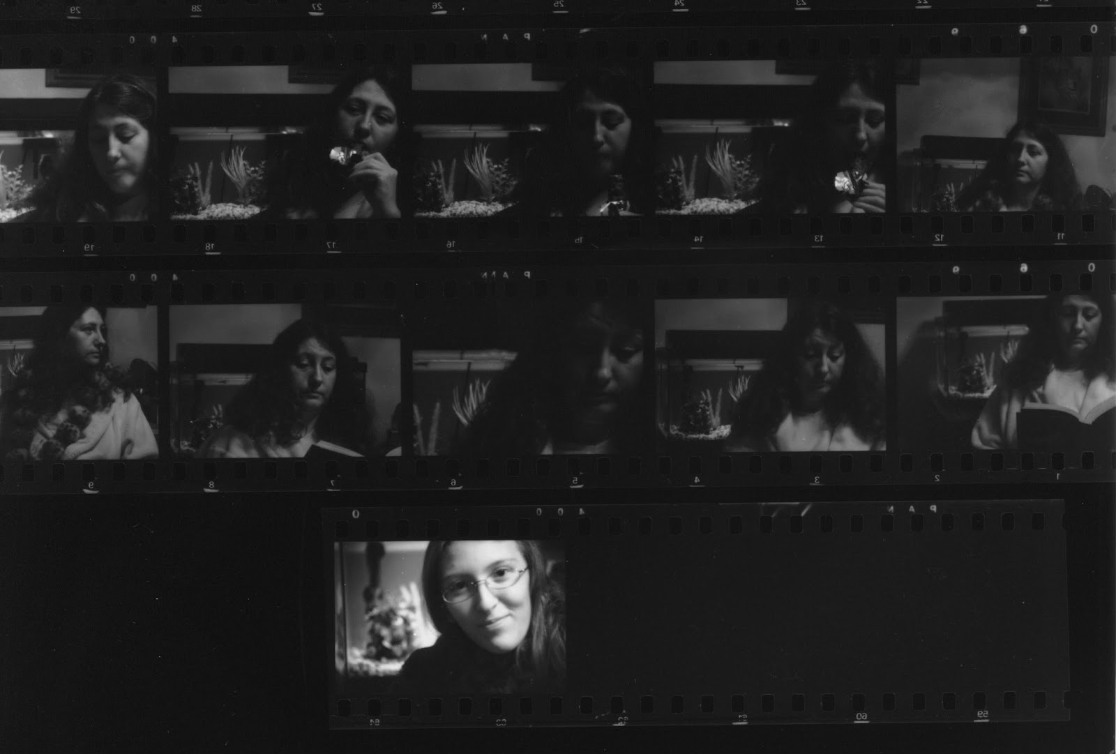
This is the bottom half of my contact sheet. This portion mostly has my mom.
In order to get her to be more willing to let me photograph her, I gave her a candy bar and then took a few pictures of her eating it.
At the time, she was reading the third book of the Hunger Games series, Mockingjay, so I took a few pictures of her reading as well.
I didn't want my sister nor my mom to feel pressured into acting a certain way, so essentially I gave them a prop or two and told them how to act with minimal instruction.
A few times I told them to look certain directions in order to get a side view of their face.


This was the first print I made of the portrait project.   We had a substitute this day, so I had no idea how to grain scope. But being my first print even, I think it turned out decently.
There were a few specks of dust on it that I had to remove in photoshop, but after all that, I really like this picture.
This is a picture of my mom eating the candy bar mentioned above. I like how half of her face is shadowed, and half is light.
The reason I chose to print this picture first was the fact that the candy wrapper was really bright, and is really clear and in focus. 


This was a picture of my mom, that I took while she was reading. I really like this picture because it's different than the one on top. 
It's a little brighter, and the fish tank in the back is a little less focused, making my mom's face show up a bit more.
In this picture, I brightened it a little more in photoshop, but also made the shadows on the left side of her face darker. 


This is a portrait I took of my younger sister. I really like this picture because it's really out of focus in the back, which makes your eyes go directly to her face. 
I think it's really interesting how her eyes are all dark, except for where the light is reflected in them.
She doesn't smile very often, so to actually have her somewhat smiling in this picture is a kind of achievement for me. I think she looks content in this picture, not overly happy, but not depressed either.
I love how her hair is really sharp in the front, and in the back it's all dark.

Wednesday, April 18, 2012

Project one: Pictures of something cool, beautiful, or interesting!


This is my contact sheet for the first project we did, where we used our traditional cameras. Our assignment was to go and photograph anything cool, interesting, or beautiful.
I didn't really like any of my pictures for this project, because I mostly just spent my time playing around with my camera settings, and figuring out the basics of it. Most of the pictures I took, the lights were really dim, so it was a longer shutter speed, and I didn't have a tripod to set my camera on. Due to this, most of my pictures are blurry.


This is the one picture that turned out decently from my first photo project.
It's a picture of my sister's aquarium. 
I like this picture because in the left, there's a little rock structure, that I think turned out really nicely.
However, most everything else in the picture are too dark, or not in focus.
But seeing as how this was my first time ever using a traditional camera, I'm actually just glad that I got pictures that are able to be seen.

Monday, April 16, 2012

Tilt Shift Pictures!


This was a picture I took at the Mr. Timberwolf assembly. For this tilt-shift, I blurred the area around one of the candidates, in photoshop, and made him stand out more than the others. 
I think this picture is really cool, because you can see the whole gym, which I think makes the center pop out a little more. I like this picture because if you look closely, the candidate's reflection is also in focus, while none of the others are.


This picture, I also took at the Mr. Timberwolf pageant, but at a later point in it. Instead of focusing on the candidates for this picture, I focused on the shirt on the left. I didn't want to focus on any of the boys, because I had already done that, but I saw the shirt and thought it would look pretty cool to have that be the main focus of the picture. Which in fact, it does.


This picture is of the Pumpkin Regatta from October. I think this picture is perfect for the tilt-shift because of the way the water looks, and the crowd in the background. I really like this picture because the leaves on the trees are mostly changed, and it really captures the beauty of fall. The sky is partially visible on the top of the picture, which I think adds to the picture as well.
There are three pumpkins in the picture, with four people in them. I focused on the girl and guy in the far left pumpkin, just because the way she's positioned is kind of funny. The guy on the right had a headband with lightning bolts, so I blurred him out, because it kind of makes you wonder (if seeing it for the first time) what he's wearing.


This is a blossom tree from California. I really like this picture because it turned out really nicely, despite the fact that my main focus was a significant part of the picture. 
I like the trees in the background, because the way that they have no leaves, it makes the beauty of this tree really stand out. 


This last picture is from the Mr. Timberwolf pageant again. This time, I focused on the guy with the checkered shirt. 
I particularly like this picture because of the long shadows, and how his shadow is the clearest one of them. Also, I think by blurring everything around him, it makes the viewer wonder what he's doing. He's the only one with one foot in the air, while everything else seems to be doing similar dance moves.