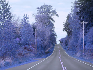
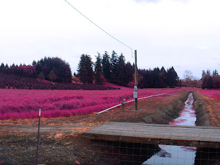
For this project, we were to take digital landscape pictures, and then open them in photoshop to create infrared pictures. I really liked this project, because I was able to manipulate the different filters and adjustment layers in order to get the effects I wanted.
This is one of my favorites, since I think the buffalo look really cool in it.
I was thinking of making it look like a wasteland of sorts, with the buffalo being the only living animal.
I think it's really cool how cloudy the sky looks, and how it adds to that effect.
I wanted to make the ground a yellow, but when I tried that, it changed the sky's color too much to make it seem more realistic, which was what I was going for.
This is another of my favorites. I love how the tree, having been mostly brown/black, wasn't effected by the infrared effect, while the background bushes and trees were.
I was going for again, a more realistic look, since that's what I find most appealing to me.
I love the clouds in this picture, since it's so dark and gloomy looking (OREGON!)
I simply love the tree as well, and am really glad the infrared effect didn't change it.
This picture is really cool, because of how many photo filters I added, to make the sky more blue.
I also like the two lone trees on the right, and the little flowering tree in the left corner, because those just add to the serenity feel of the picture.
I had a lot of fun with this picture. I wanted to make one like some of the examples, and make it look 'snowy'. So I added a lot of filters to keep the sky from turning any odd color, and changed the saturation/hue on the trees to get the look I want.
I'm really happy with this picture because I think it's probably one of the more realistic pictures (WHICH I LOVE!)
This was the same picture above (as you can see). except I changed the color a bit. I wanted to try a bluish look, because I thought it would look cool. And it did! I think by adding a lot of filters, I was able to manipulate the colors more, to get them to look the way I wanted.
This one turned out really cool. I like the sky, and how it was really bright, so it added more to the 'feel' of the picture. I wanted to go for a softer pink, and am really happy with it. The tall trees in the background, I think, look mysterious due to the brightness of the sky. It blots them out somewhat, but still allows you to know they are still trees.
I like this one, because of how many different shades of magenta there are. In the front, you have the brighter ones, while in the back you have the darker and more subtle magentas. I especially like how the water has hints of pink, without making it seem way overdone.
I like how much depth there is to the picture, which looks really cool in my opinion.
This was a picture of a vineyard that I took. I really like how soft the pinks look on the trees, making it look almost orange.
I think the angle of this picture (with more sky on the right than the left) really looks cool, while the straightness/uniformity of the rows of vines, makes it really contrasting, yet cool.


No comments:
Post a Comment