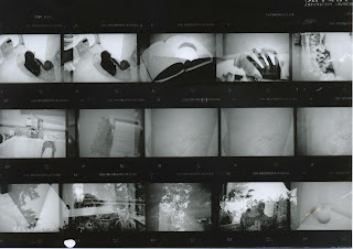
For this project, we were supposed to take a roll of film and run it through our camera twice, at an ISO of 800.
This is my contact sheet for this project.
This picture is one of my favorites.
It's a picture of my little sister (Which turned out like a silhouette) and a picture of our backyard.
I really like this, because the silhouette looks really cool, contrasting with the sky and the plants behind her.
In the negative, you can actually see her face a bit, but I like how, in the print, it turned out darker and most of the details are missing.
This picture is of the side of my neighbor's house, and a golden-colored sailboat we have hanging on our wall.
I think this picture turned out really cool, with the house really faded, making the boat stand out a bit more.
You can see a tree in the corner (left) which adds to the picture.
I like how little sky there is, allowing you to focus on the boat and the house.
This is my absolute favorite picture.
I love my cat, and took several pictures of her with this roll.
But this one is by far the coolest.
I somehow managed to take the pictures so she was facing two opposite directions. The over-lapping area looks really cool because her eyes really stand out.
My cat is pure black, so that makes this picture slightly scary, as she looks like she's glaring at the camera.
On the right, you can see the slight outline of her tail.
There's a tiny bit of shadow, which looks kind of cool on the left side of her.
For this multiple exposure, I took a silhouette of my hand, and then took another picture of a flower.
I really like this picture, because of how well the hand silhouette stands out against the brightness of the background.
I also like how part of the background is blurred, so it makes the flowers stand out a little bit more.
This picture is of my back deck (hence the potted plants) and then a shelf over my stairway in my house. (As you can see by the chandelier in the left corner.)
I think this one is really cool, because of how sharp all of the different elements of the picture look.
I like how each object is crisp and in focus, so you can tell what they are.
This is the last two multiple exposures stacked on each other.
I like it because it's very light in the background and dark in the foreground.


No comments:
Post a Comment